
This brochure was designed to expand the Weitzman brand recognition to international markets. The theme I created throughout the brochure was around Stuart’s creativity, and…
February, 2012

A happy look was the goal for this series of children’s activity book covers. I engaged Nancy Friedman, of Wordworking, to come up with the…
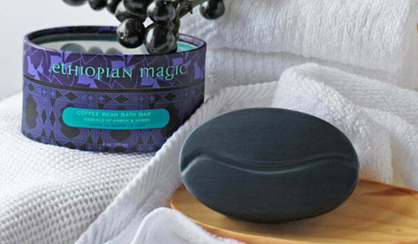
Body Coffee is a body-care product company that uses coffee-based and other natural ingredients. They created a line of specialty soaps with an international theme…

These candy tins, which are sold to specialty stores, were conceived as gift packaging for traditional candy. I aimed for an neo-classical, upscale look, giving…
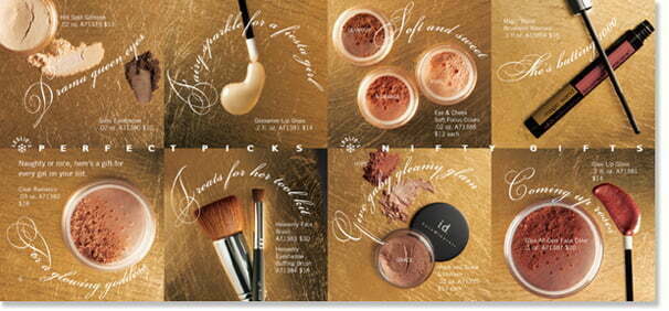
Bare Escentuals is a beauty company the products of which are made from pure minerals. They market their product through the television channel, QVC. During…

Before this delightful magazine folded, I did various direct response pieces for them, including the book-a-log, and premiums such as this calendar, which I designed…
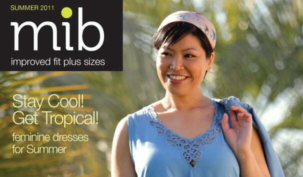
MIB, a plus-size fashion company, needed to bring their look up to date. Since the quality of their garments is an important part of their…
Someone (Emerson? Oscar Wilde? Mummy?) said that consistency is the hobgoblin of little minds, and I enjoyed seeing how far I could mix it up…
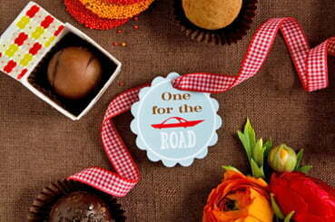
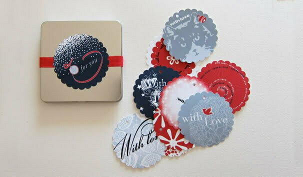
Pastry chef extraordinaire Monica Kühne, based in London, hired me to design all the graphic accoutrements for her theme-based dessert tables, created for a…
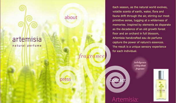
An artisan-crafted, all-natural alternative to high-end department-store brands, Artemisia perfumes are crafted from a variety of elements. The branding challenge was to convey the craft while maintaining…