
Sometimes I need to take a break from painting, and messing about with linoleum printing provides a nice change of pace. No colour, no tonal fuss and muss and the format is small and manageable. Since I just use one colour, the only challenge is to render everything in black or white.
About 20 years ago, the terrific artist, Patricia Curtan was generous with her time and professional printing press. She taught me the essentials for creating linocuts, though I hadn’t worked in this medium since then. I wasn’t content with my hand-done prints (achieved by rubbing a wooden spoon across the back of the paper to which the lino block is pressed), and gave up the process.
Recently, wanting to play with the linoleum medium, I ordered an inexpensive (relatively! It cost me 200€) FOME table etching press. This works much like a pasta maker, with the paper & lino block—or pasta dough— rolling through two cylinders that press the paper & the inked block together.
I was very unhappy with my first (and second and third etc. etc.) attempts, as the movement of the roller jiggled the block so my prints were blurred. (A real lino press—which costs upwards of 2000€, and is a huge, heavy machine—doesn’t move the print, just exerts great pressure in one downward smash.) A crafty friend suggested I stabilise the system by inserting a metal plate between the back of the paper and the felt blanket that sandwiched the layers together, and that worked pretty well.
Here’s the process I’ve worked out with the table press:
1.Draw something
2. Flip the image in Photoshop and print out
3. Spray the back of this backwards image with Photomount or Spraymount and paste it to the back of a sheet of Saral Transfer Paper.
4. Spray the graphite side of the transfer paper with the Spraymount and paste that to your linoblock ( I use unmounted linoleum, as the kind that’s mounted to a piece of wood won’t fit through the press)
5. Go over the whole drawing using a ball-point to transfer the drawing onto the block. In case the drawing and Saral slips I tape the whole thing to the lino. I colour in everything that’s to be inked so I don’t get confused when carving—only carving the areas of white.
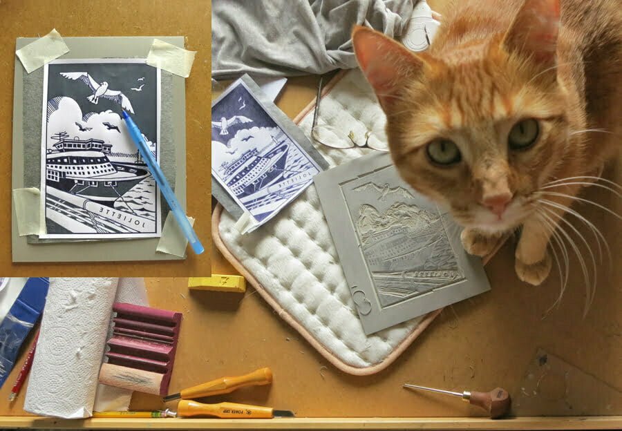
6. Use good quality carving tools (I use both the the Swiss brand Pfeil, and the Japanese Powergrip, which I got from Hidatools in Berkeley CAs). Don’t carve too deep, and keep honing and sharpening the tools as needed to keep the cuts precise. I got a honing kit Slipstrop from an art supply site and 4 shaped sharpening stones from 2 Cherries brand. As you can see, I keep my linoleum soft by carving it over a heating pad. My cat likes the heating pad, but is actually just curious about the little curls of linoleum detritus.
7. Once you’ve carved out everything that doesn’t print, cut back the piece of linoleum with a box cutter so it barely has a border. This prevents undesired ink marks outside the image area.
8. When you’re ready to ink, tape to a smooth surface—I use a piece of glass, which works both for holding the lino block and a place to roll out the ink. Use whatever you cut away from the original piece of lino to hold as a frame for the linoblock. (Apologies that my photos don’t always show the same block going through the various steps—I forgot to document while I was printing. And you can see that I used a brown linoleum for the “Panier” image, but I recommend the grey as one can see one’s drawing better)

The ink I use is Cranfield, which washes out with water. Use a roller that is wider than your image. Smear a line of ink across the glass and roll back and forth until the ink is even on the roller. Roll across the lino block; the frame you’ve put in place will help prevent the roller from dipping into the white areas.
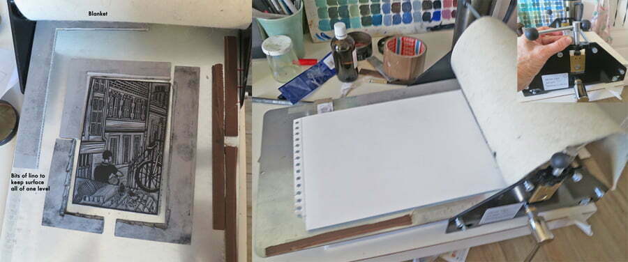
9. Here’s the press set-up. the lino block in the center. I put a bracket of lino to show me where to position my paper. Between the blanket and the paper (not shown) I insert a metal etching plate just to keep things steady as the sandwich of lino/paper/metal/blanket goes through the rollers. The inset shot is of me using a chip of lino, measuring to ensure the pressure of the rollers is even, left and right.
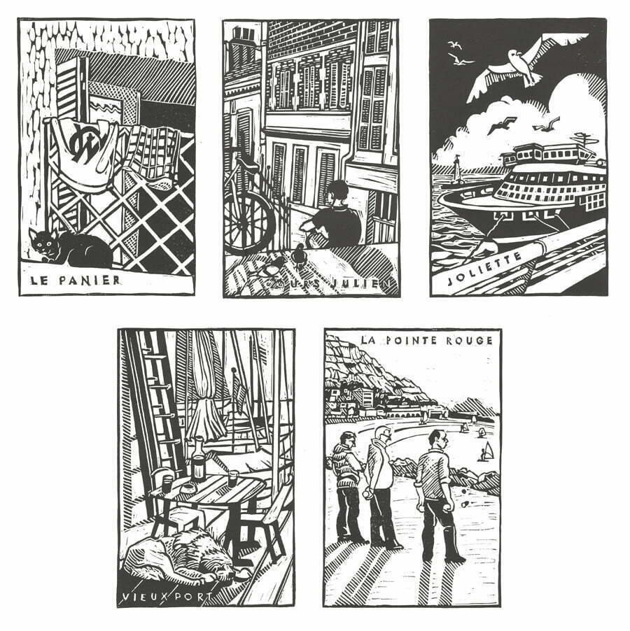
The Marseille series of five represent some classic neighbourhoods of the city, based on my experiences there, usually while waiting for something or someone. If you’re curious, here are my reference photos.
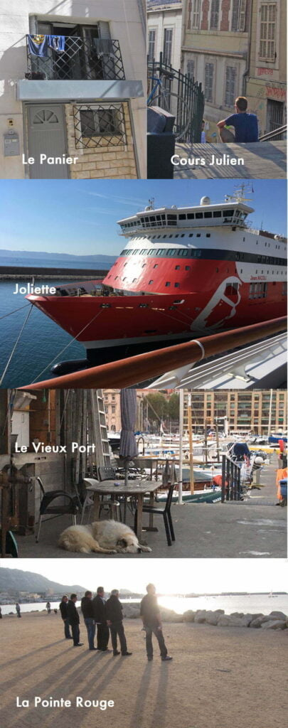
For Le Panier, which borders the Vieux Port to the North, now turned fashionable since they pushed the ports further North, I was sitting in a café enjoying the sunshine and saw this black cat, also enjoying the sun, basking on a balcony beneath some drying clothes. I changed the t-shirt to be one of the emblematic Marseille OM football team.
Le Cours Julien is in a hip ‘n cool neighbourhood in the centre of downtown where one can find original clothing made in Marseille and it smells a lot like weed. I was waiting for a friend with a glass of wine for this moment.
The Joliette neighbourhood —I call it that after the eponymous metro stop— is north of the Vieux Port and is on the docks where the cruise ships berth. This area has been made very commercial with a shopping centre and restaurants. I saw this ship whilst hanging out with friends waiting for a play at the nearby CEPAC Silo theatre.
Everybody knows the Vieux Port, the oldest part of the town. I take an Argentine tango class and go to Milongas at the friendly Tango Por Vos dance centre. On my way to class I always pass one of the boat repair places on the Port, where there’s this huge white dog, along with the workers having their apéro.
The Pointe Rouge is a part of town to the South that used to be its own village until the big city engulfed it. I can’t remember why I was in that part of town, but I was waiting for a friend and hung out with the Pétanque guys while the sun went lower in the sky.
Nancy Friedman
December 13, 2019 8:36pm
These prints are marvelous, Diana! Thanks for sharing your process.
Maria
December 17, 2019 5:17pm
Hola Diana ! Encantada de ver tu trabajo acabado. Eres una artista completa, no dejo de admirar tu capacidad creativa. Gracias, saludos !
Ellen Parker
December 17, 2019 5:43pm
Wonderful, Diana – a very essence-oriented way of presenting an image – does that thought even make sense? Lovely to see. Thank you!
Dave
December 18, 2019 1:49pm
Like! Like! Like!
Daniele Rudloff
July 15, 2023 11:57pm
Hello Diana,
I’m the friend of Pierre who had this dog you désigned on the old port .
I just read your name on your printed card and Pierre wanted to thank you for it and the dog’s memory passed away from this Time
Diana
July 16, 2023 9:02am
So glad it helped Pierre with the sadness of losing that great dog!