Watercolour on paper, 28 x 18cm (11 x 7″) Not available.
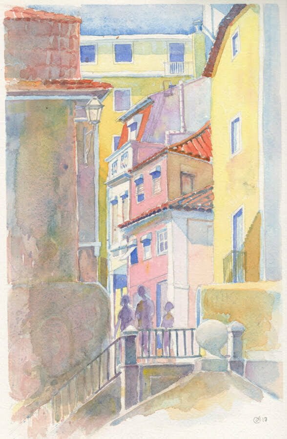
The old neighbourhood of Bairro Alto in which we stayed.

Watercolour on paper, 21 x 28.5cm (8.25 x 11″) €250 SOLD.
The biggest challenge for this painting was working fast to prevent a hard edge between the background peaks and the sky. An edge like that would draw attention away from the focal point, and doesn’t look real.
Watercolour on paper 28 x 20cm (11 x 8″)
Watercolour on paper, 19 x 24cm (7.5 x9.5″) Not available
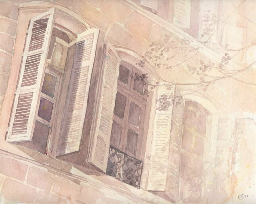
This was an tonal exercise. Since the façades of buildings are so darned complicated around here, I chose to just depict a few windows, and further simplified the task by fading out all but set of shutters (volets).
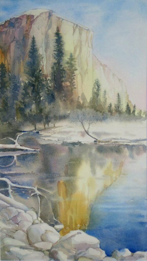
watercolour on paper, 38 x 24cm (15 x 9.5″) Winter in Yosemite, low mist
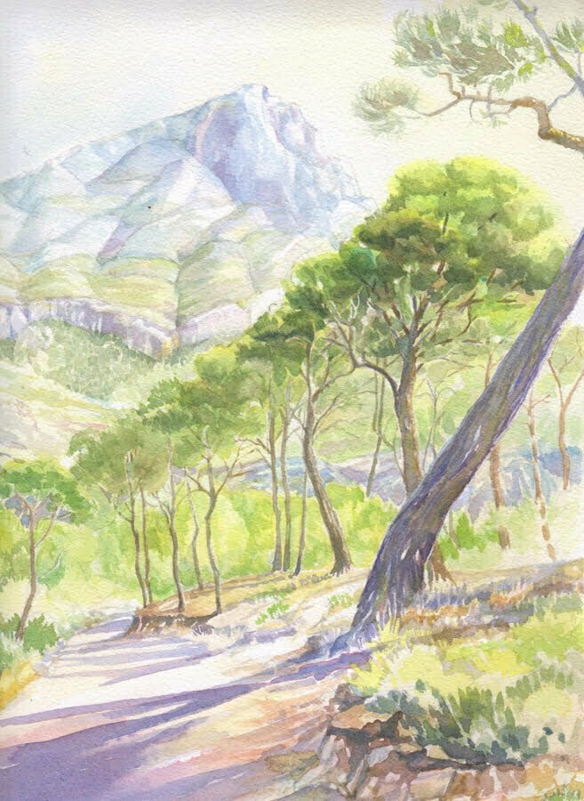
watercolour on paper, 34 x 23cm (13.5 x 9″). There are great hikes around our famous mountain. As usual, I am attracted to the trees; here the sinuous trunks of the pin parasols.
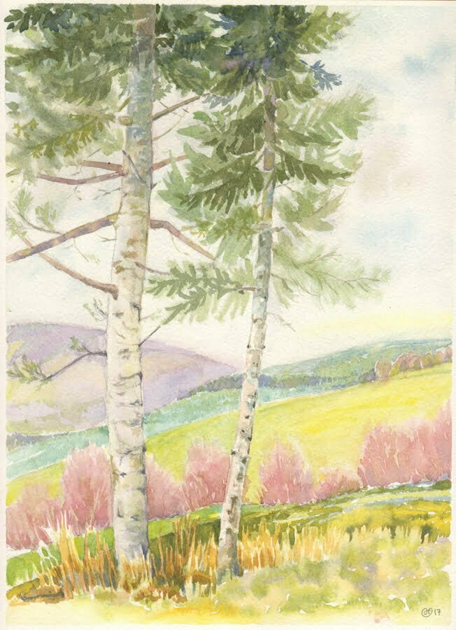
Watercolour on paper, 28 x 20.5cm (11 x 8.13″)
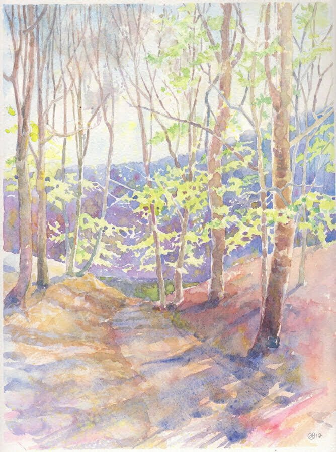
Early spring in the woods when the tiny, bright green leaves emerge. The challenge was keeping all that negative space! Champin is a rural hamlet in the hills behind the Rhone about an hour southwest of Lyon